REMINDER
Share your website to have feedbacks
-
Hi,
I think it would be great if some of you would like to share their AppDrag websites to ask for feedback or just to show us projects you're proud of! -
Hello everybody,
I think it's a good idea and I'd like to be first. My project is [www.londonviptransfers.co.uk] and this is a website of my business - London chauffeur services.
I moved my website from WP and I'm really happy with the outcome. Note: I'm an amateur/hobbyist and always enjoying learning new things like web design, SEO and PPC.
Everything I've done by myself, but I know there is always a lot of work to be done.
So, once I'm here may I ask fellow appdragger's to have a look and give some feedback, please? Anything from bad colours, fonts to major issues if you can spot one.Thank you very much
-
Hey, thank you very much for sharing with us!
Here would be my review :
- I'm not very fan of the centered text with box shadow on it, I would go on a more traditional way like this

- The content is great with storytelling, reviews, pricing, booking, support!
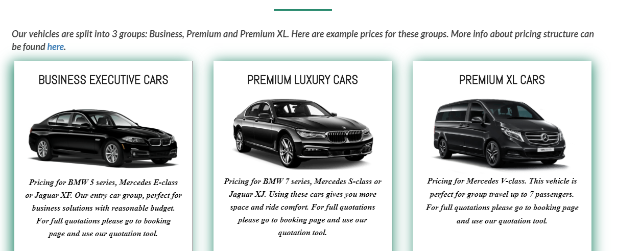
- Here I would center the text "our vehicles" and there is a black border on the right of the first two cars
-
There are too many different font-families I would stick to one for normal texts and one for titles (maybe three if really needed but not more, instead play with bold / italic / colors)
-
For the topbar the logo has a different background, maybe I would go this way (it's a matter of taste but as your business is in the luxury domain, pure black looks convincing for it). I reduced a bit the logo size and added top and bottom margin to look better)

- On the footer you used a background size "Contain" instead of "auto" which pixelate your background, you should try with "auto"
That's all for me, thanks again for sharing, maybe other community members would have other feedbacks to give to you. Wish you the best on your business!
-
@Wassim Thank you very much for the feedback. Your suggestions are spot on, I'll definitely look into font families and other things. The actual business is a bit slow at the moment (not many flights, people work from home) so I have plenty of time to work on the website and creating content.
Once again, thank you. This is a great community")
-
@Maciej-Bienkowski congrats on the site you did a good job
 ️️ Here is my advise with regards to colour choice. I would perhaps choose one colour and use it e.g on buttons and the rest in Black and White. Then the colour pops out of the page and allows you to accentuate certain important things on your Page e. g. a call to action. Here's a fun and free resource for playing around with colours: color.adobe.com
Good luck with your te
 [link text](
 -
@Linda-MacDonald Thank you for taking the time and for your advice. I saw your original response and was wondering, what and how I could (should) change it. I never heard before about the color.adobe.com, but it's really cool and helpful. I see now I have buttons in bright red, black, and even blue and I'm thinking this is probably too much...
What about a top menu? Wassim suggested to make it in black to match the logo background colour and I'm still debating in my head what to do. I kind of like the green/greenish colours and that was in my head when I made a decision about colours on my website. Do you think I could keep some of the green? Or perhaps it's not the best colour for the business like mine?Thank you
-
@Maciej-Bienkowski
ah yes what a messy response you got...was fighting with my mobile auto-correct and on top of that managed to place a text holder lol my apologies.
from a UX perspective (user experience) negative space is just as important as the use of space. (here's a little article on that matter, but just google negative space in web design and you'll probably find tons of info") ) Keeping the importance of negative space in mind I would perhaps reduce your shadowing and/or colours and only use them for something that you REALLY want your user to take notice of. That will make the element POP out at us and we will take extra notice cause our eyes automatically stop at something which is different.
) Keeping the importance of negative space in mind I would perhaps reduce your shadowing and/or colours and only use them for something that you REALLY want your user to take notice of. That will make the element POP out at us and we will take extra notice cause our eyes automatically stop at something which is different.
https://passion.digital/blog/what-is-negative-space/#:~:text=Also known as 'white space,or background on the page.
You can CERTAINLY use several colours. The trick is to keep colours within the same family of colours (typically referred to as hue) If you however want to make it easy I would recommend that you stick to just one accent colour because having a complex colour scheme might be quite a hand-full even for the best of designers.
The resource I sent you (the adobe page) will help, you can even upload your logo and the tool will generate a colour scheme from it because as general rule of thumb website colours are very often chosen from the logo. the adobe thing was just an example, there are probably a ton of resources if you google web design colours or something like thatWith regards to whether you should should have a black or white background on your menu. I went to your site to check it out but cannot see the menu item. Perhaps you are working on it?
oops just saw sceenshot.
black can be very funky especially if you don't go with a pure black. Your logo is metallic gold isn't it? I personally wouldn't bring black into the mix also. Either have a white background or flat out go all in and invert the entire page to a subtle off black and then have your text in off-white. An alternative which I typically make use of is to have a transparent header - your text and logo are then placed on top of an image and if you give your image a darker overlay and give your navbarlinks a lighter colour then it all looks nice -
@Linda-MacDonald I was thinking about my top header menu background (as on picture).
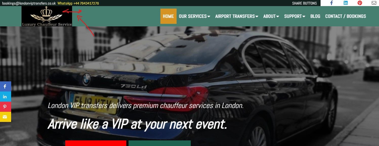
Currently, it's green (ish) and Wassim suggested that maybe a black background would be better. He inserted a screenshot in his response to show how black colour is better blending with my logo background. I also have this logo without a background, but as it's gold it didn't stand-out as I wish.
Thank you, for another resource to learn new things, I never thought about negative space. Definitely need to read more about this as well as to experiment with colour palettes.
If you don't mind I'll ask you again about your thoughts, once I learn new things and change my website, but this will probably happen after Christmas time.
All the best -
@Maciej-Bienkowski I actually like your green
the only thing you might want to consider is to give your logo a transparent background so that it doesn't have the black box around it...perhaps the person that made your logo gave you a png file? e.g logo.png - that is the format for a transparent background alternatively you might be able to use https://photoscissors.com/
not sure about this site as I haven't used it but you would get a freelancer to do it for you online for very little money