REMINDER
Support dynamic columns using CSS Grid in Site Builder.
-
It's certainly supported enough and makes it possible for automatic column breaks when using back-end functions to repeat data in columns.
-
Hey Thomas,
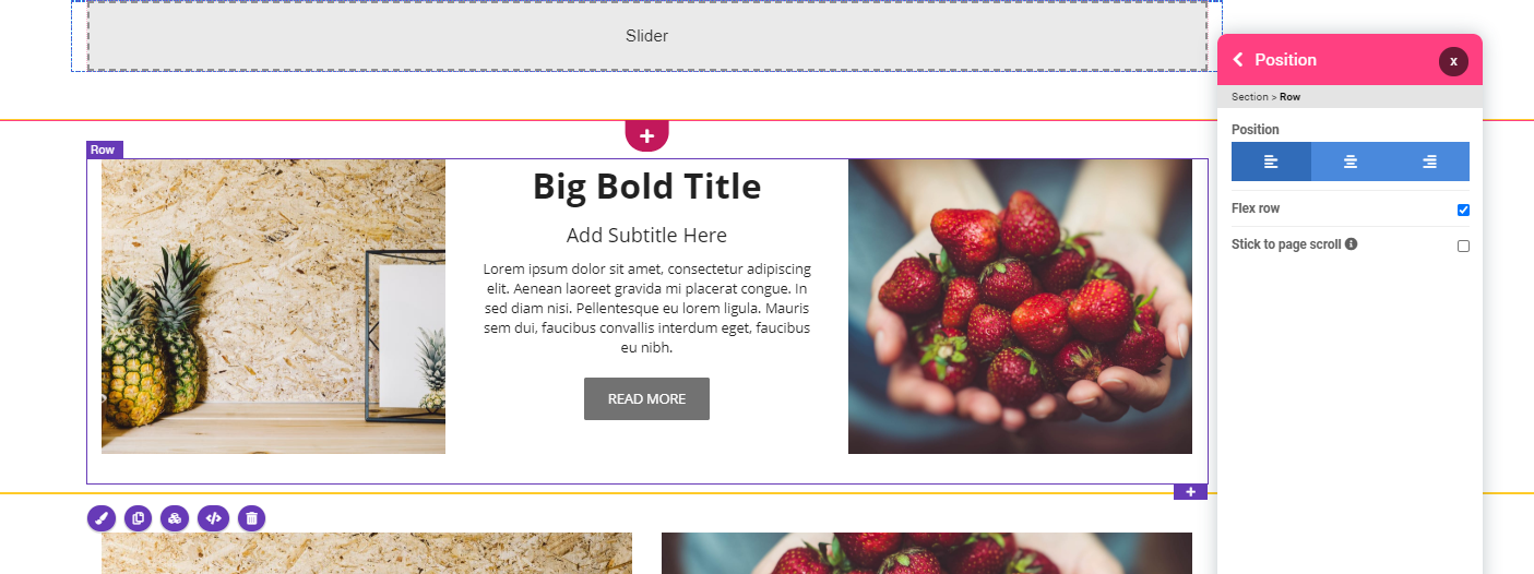
When you edit a ROW in the pagebuilder > Position, you can uncheck Flex row which is forcing all columns in that row to stay on the same line. Once unchecked it will be able to go to several rows. For eg if you have 3 columns per row and you are generating 8 columns you will get 2 rows of 3 columns plus 1 row of 2 columns


-
I tested with the one you're using in your example, I get 3 columns down to 768, then all columns are full width.
If we had support for CSS Grid, then we could configure the content to break where it looks the best. In my case, that is 3 columns until 992px and then 2 columns until 650px.
The Flex solution currently in use don't work when using it in combination with Back-end Function, because when you remove the other 2 columns in your example, the inline-calculation will change from:
width: calc(33.3333% - 30px);towidth: calc(100% - 30px);which of course breaks the column flow.I'd say, it's time for something more flexible (no pun intended) and configurable, for the columns.
-
This is a frequent pattern, what we do usually is to have 3 columns, first one with your datasource content and 2 others ones empty, this way, the first column that will be repeated will have a correct size.
Anyways, yes we might check CSS Grid

-
@Joseph-Benguira said in Support dynamic columns using CSS Grid in Site Builder.:
This is a frequent pattern, what we do usually is to have 3 columns, first one with your datasource content and 2 others ones empty, this way, the first column that will be repeated will have a correct size.
Anyways, yes we might check CSS Grid

Right, I didn't think of having invisible stuff hanging at the end and I don't think anyone else will, either. Here's to hoping for a proper CSS grid implementation

-
@ThomasD I would absolutely love to have css grid
