@joseph-benguira I started over with a very accurate case starting from scratch 
I proceeded that way :
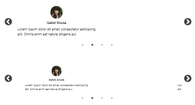
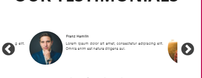
- Creating a Testimonials carousel
- Printing only slides one by one
- Changing a bit the disposition (or the right text will just adapt and the issue will be hidden), putting the picture and the name above the text.
Once it's done, I duplicated it with the following difference :
- The first one is not centered (not ticking the box "Center content")
- The second one is (ticking the box "Center content")
As a result? looking at it on a laptop (150% of desktop screen) or mobile phone :
- The first one is not centered (obviously)
- The second one get overlapped by the previous and next slides and is still not centered

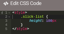
Noting that I added the css just in case :

I try not to trick it by code myself too much since it's an AppDrag feature that my clients are using.
See you soon,
Best regards,
