REMINDER
SOLVED Carousel : "Center content" not working
-
Hello,
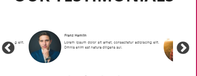
When you use the Carousel, it looks like the slide is now :
Not centered if you don't tick the "center content" checkbox :

Broken if you tick it

Is it a known bug ? Any fix coming or quick fix in the meantime ? Did I do something wrong ?
edit:
If you want to see for yourself : https://tm-major-tom-74f613.theprojectory.frThanks :),
Best regards, -
Hey @pierre-sulpice, this issue is under investigation
-
@joseph-benguira Noted thank you for the update

-
Hello @joseph-benguira

Any news on that topic ?
The carrousel is used in a lot of websites and it's penalizing kinda to not being able to rely on it
See you soon,
Best regards, -
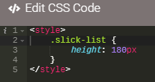
Hey @pierre-sulpice you should be able to adjust it with css, drop a block of CSS code on your page and add this
.slick-list {
    height: 180px;
}
I've tested with you sample page and it fixes the issues

-
@joseph-benguira hum sorry but it looks like it didn't do the trick :
- At first it looked like it was centered for the first carousel of the page but the size changed (obviously) and the text got cut
- I tried the button centered (ticked then unticked) while keeping the css and it looks like it broke again
- It looks like you want to give a fixed size but I have more that one carousel on the same page ?
Do you want me to give you access to the project if you want to check it in depth ? Knowing that all I really did is create any carousel and it happens when you zoom in (mobile view)... or if you tick center no matter the size (with the weird overlap as shown on the first post)
See you soon,
Best regards, -
@pierre-sulpice In fact I still don't understand your issue ...
In my last screenshot the carousel seems working ok with the css to fix the height of the carousel
what is wrong with it?If you have an issue with one of the settings, don't use it and add a css block to achieve what you need
-
@joseph-benguira I started over with a very accurate case starting from scratch

I proceeded that way :- Creating a Testimonials carousel
- Printing only slides one by one
- Changing a bit the disposition (or the right text will just adapt and the issue will be hidden), putting the picture and the name above the text.
Once it's done, I duplicated it with the following difference :
- The first one is not centered (not ticking the box "Center content")
- The second one is (ticking the box "Center content")
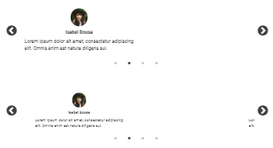
As a result? looking at it on a laptop (150% of desktop screen) or mobile phone :
- The first one is not centered (obviously)
- The second one get overlapped by the previous and next slides and is still not centered

Noting that I added the css just in case :

I try not to trick it by code myself too much since it's an AppDrag feature that my clients are using.
See you soon,
Best regards, -
@pierre-sulpice thanks for the details, we will check based on that
-
@jbenguira Great thanks a lot :)))
-
-
@pierre-sulpice it's still in our backlog
It will be fixed but I don't have an ETA yet -
@pierre-sulpice great news it's now fixed
